


I initially conceived of Invisible Cities as a bookstore in honor of the Italo Calvino novel in which the fantastic cities Marco Polo describes to Kublai Khan metaphorically represent the act of storytelling itself. What better name for a bookstore than a collection of invisible cities, or fictional worlds?
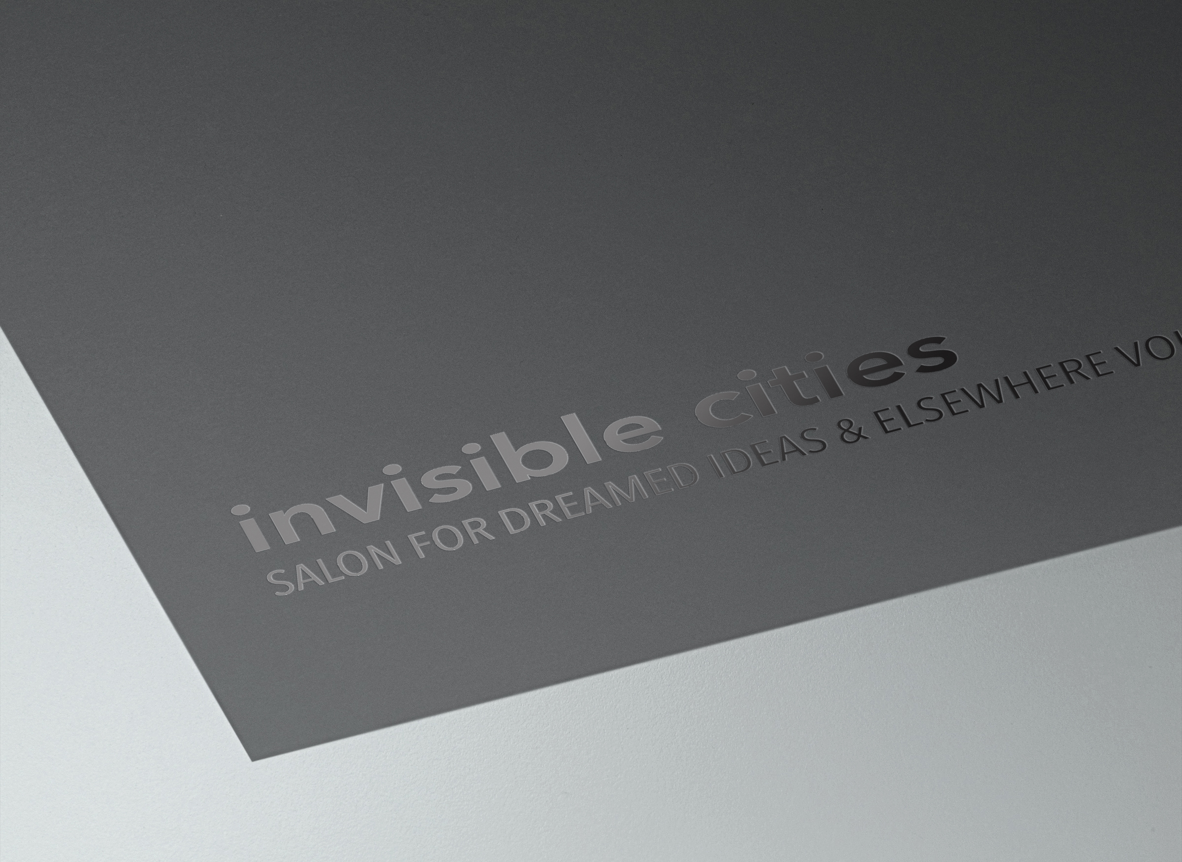
I ran into a problem, though. I had this idea that the identity of Invisible Cities should be both visible and invisible as fictional worlds are both made up and true at the same time, or as our thoughts are both in our heads and real at the same time. This idea led me to the concept that the Invisible Cities mark would be printed in varnish, embossed, or treated so that the text was not a separate color of its own but would still be visible. Hence, both visible and invisible. However, this king of logo would not serve for a retail solution; because I created the client, I was able to redefine the client not as a retail outlet but as a salon, a group of writers and thinkers who get together and read their work and discuss ideas periodically.
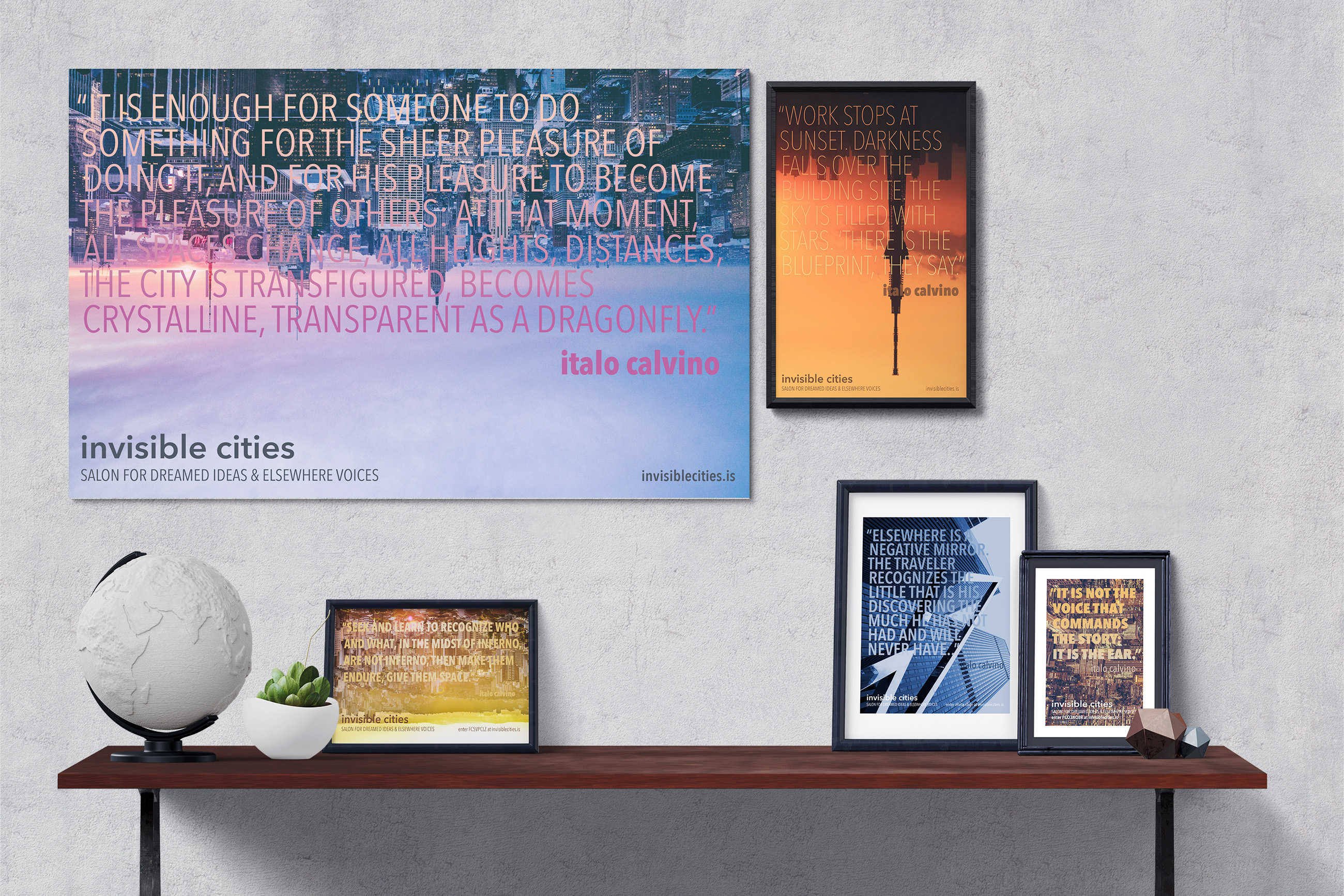
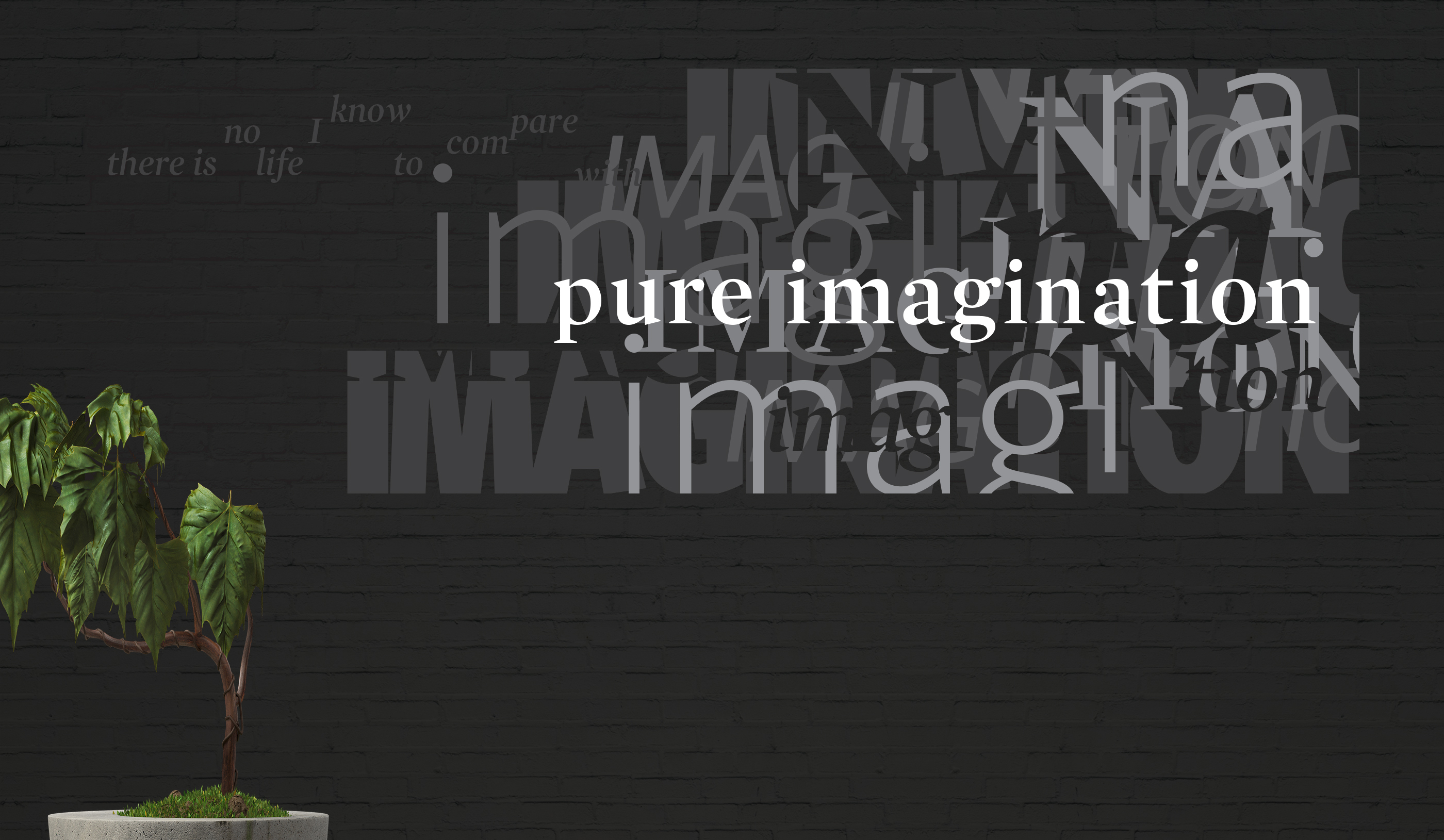
The concepts of visibility and the salon lend themselves to a somewhat secretive organization, which brought me to the concept of the salon being invite-only. The group attending the salon would not be elitists in the traditional sense, though: Invisible Cities would be a place to speak and hear difficult and outsider ideas, again tying back in with the novel in which both the narrator, a foreigner in a foreign land, and his listener, the ruler of that land, challenge each other's perspectives. Because the concept is somewhat esoteric, the design is kept minimal and the main color palette is a stark black and white, again referencing the many dichotomies addressed by Calvino's text. That being said, the images used in print materials vary widely--with as many color schemes and style of city photographed as there are cities described in the original text.